This morning as I was creating a new VM on Azure, I saw that the process has changed
Here are the new screens
After selecting your VM to deploy, in my example below Windows 10 Pro Version 1803, click on Create
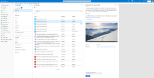
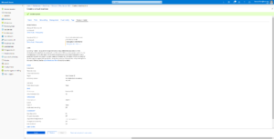
Here are the new screens, presented like Tab.
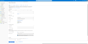
Selection:
- Subscription
- Resource Group
- VM Name
- Region
- Availability options
- You can still change the Image if needed as well as the size
- Provide local Admin Username and Password
- Inbound Port Rules
Click on Next : Disks >
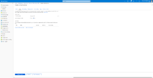
Here you can change the OS Disk Type and select if you want managed or unmanaged disks
Click on Next: Networking>
Select your vNet, Subnet and Public IP (if needed)
You can chose NSG and Public inbound port
Click on Next: Management >
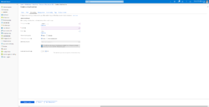
Here you can select Boot and OS guest Diagnostics and well as Identity and Auto-Shutdown
Click on Next: Guest config>
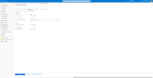
Here you can select extension to install
Click on Next: Tags>
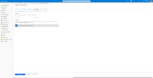
Here you can define Tags
Click on Next: Review + create>
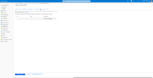
After validation click on Create
My opinion is that the new proposed screens are more logical for the creation process with some new options during VM initial creation.
As reminder before we had 4 steps:
- Basics
- Size
- Settings
- Summary
And now we have:
- Basics
- Disks
- Networking
- Management
- Guest config
- Tags
- Review + Create
Thanks
Arnaud